Building Custom TabBar Indicator in Flutter
A quick tutorial on building a custom tab bar indicator in Flutter.
Almost every other app has multiple groups of content. Tabs allow you to organize and navigate between these groups of content seamlessly in your app. Flutter has its own TabBar and TabBarView widget to create tabs and view it's content.
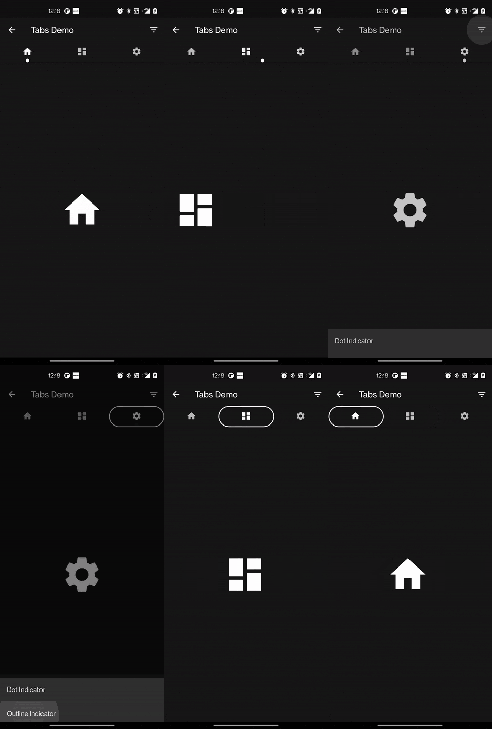
In this tutorial, we will be building some custom TabBar indicators as shown below.

Content
Building TabBar
Let's start by adding a TabBar to our app.
First, let's define a TabController. TabController coordinates tab selection between a TabBar and a TabBarView. Either you can create your own tab controller or use the DefaultTabController.
DefaultTabController(
      length: 3,
      child: ...
);
Now let's add a TabBar widget within an AppBar.
return DefaultTabController(
      length: 3,
      child: Scaffold(
        appBar: AppBar(
          title: Text('Tabs Demo'),
          bottom: TabBar(
            tabs: [
              Tab(icon: Icon(Icons.home)),
              Tab(icon: Icon(Icons.dashboard)),
              Tab(icon: Icon(Icons.settings)),
            ],
          ),
        ),
      ),
    );
And finally, we will display the tab content in the TabBarView.
TabBarView(
      children: [
        Icon(Icons.home, size: 100),
        Icon(Icons.dashboard, size: 100),
        Icon(Icons.settings, size: 100),
      ],
    )
Here is what our final code looks like.
class MainTabBar extends StatelessWidget {
  @override
  Widget build(BuildContext context) {
    return DefaultTabController(
      length: 3,
      child: Scaffold(
        appBar: AppBar(
          title: Text('Tabs Demo'),
          bottom: TabBar(
            tabs: [
              Tab(icon: Icon(Icons.home)),
              Tab(icon: Icon(Icons.dashboard)),
              Tab(icon: Icon(Icons.settings)),
            ],
          ),
        ),
        body: TabBarView(
          children: [
            Icon(Icons.home, size: 100),
            Icon(Icons.dashboard, size: 100),
            Icon(Icons.settings, size: 100),
          ],
        ),
      ),
    );
  }
}
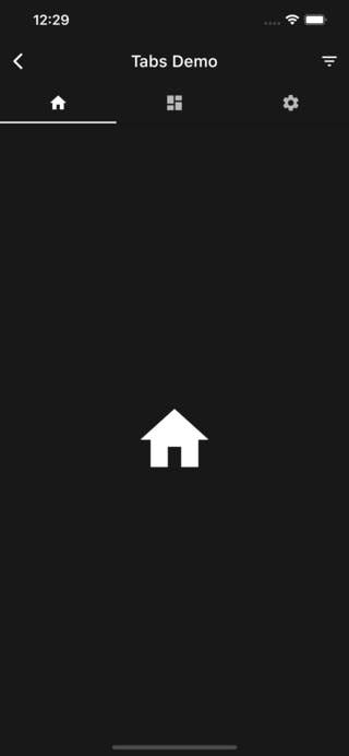
This is how our TabBar looks like. By default Flutter uses UnderlineTabIndicator. Let's see how we can create our own tab indicator.

Building a Custom Dot Indicator
TabBar indicator is basically a Decoration class. So to build a custom indicator let's start by extending a Decoration class.
class DotIndicator extends Decoration {
  @override
  BoxPainter createBoxPainter([VoidCallback? onChanged]) {
    // TODO: implement createBoxPainter
    throw UnimplementedError();
  }
}
Decoration class is the abstract interface for all decorations. To actually paint the decoration class we need the createBoxPainter method to obtain a BoxPainter.
  @override
  BoxPainter createBoxPainter([VoidCallback? onChanged]) {
    return _DotPainter(
      color: color,
      radius: radius,
      onChange: onChanged,
    );
  }
The BoxPainter class provides the paint method which will allow us to draw over the canvas.
class _DotPainter extends BoxPainter {
  _DotPainter({
    required this.color,
    required this.radius,
    VoidCallback? onChange,
  })  : _paint = Paint()
          ..color = color
          ..style = PaintingStyle.fill,
        super(onChange);

  final Paint _paint;
  final Color color;
  final double radius;

  @override
  void paint(Canvas canvas, Offset offset, ImageConfiguration configuration) {}
}
You can draw a circle over the canvas using the drawCircle method.
@override
  void paint(Canvas canvas, Offset offset, ImageConfiguration configuration) {
    assert(configuration.size != null);
    final Rect rect = offset & configuration.size!;
    canvas.drawCircle(
      Offset(rect.bottomCenter.dx, rect.bottomCenter.dy - radius),
      radius,
      _paint,
    );
  }
This is how our DotIndicator class looks like.
import 'package:flutter/material.dart';

class DotIndicator extends Decoration {
  const DotIndicator({
    this.color = Colors.white,
    this.radius = 4.0,
  });

  final Color color;
  final double radius;

  @override
  BoxPainter createBoxPainter([VoidCallback? onChanged]) {
    return _DotPainter(
      color: color,
      radius: radius,
      onChange: onChanged,
    );
  }
}

class _DotPainter extends BoxPainter {
  _DotPainter({
    required this.color,
    required this.radius,
    VoidCallback? onChange,
  })  : _paint = Paint()
          ..color = color
          ..style = PaintingStyle.fill,
        super(onChange);

  final Paint _paint;
  final Color color;
  final double radius;

  @override
  void paint(Canvas canvas, Offset offset, ImageConfiguration configuration) {
    assert(configuration.size != null);
    final Rect rect = offset & configuration.size!;
    canvas.drawCircle(
      Offset(rect.bottomCenter.dx, rect.bottomCenter.dy - radius),
      radius,
      _paint,
    );
  }
}
Building an Outline Indicator
Building an Outline Indicator is similar to the Dot indicator but instead of drawing the circle on the canvas, we will draw a Rect with a radius.
Here is a full code for Outline Indicator.
import 'package:flutter/material.dart';

class OutlineIndicator extends Decoration {
  const OutlineIndicator({
    this.color = Colors.white,
    this.strokeWidth = 2,
    this.radius = const Radius.circular(24),
  });

  final Color color;
  final double strokeWidth;
  final Radius radius;

  @override
  BoxPainter createBoxPainter([VoidCallback? onChanged]) {
    return _OutlinePainter(
      color: color,
      strokeWidth: strokeWidth,
      radius: radius,
      onChange: onChanged,
    );
  }
}

class _OutlinePainter extends BoxPainter {
  _OutlinePainter({
    required this.color,
    required this.strokeWidth,
    required this.radius,
    VoidCallback? onChange,
  })  : _paint = Paint()
          ..style = PaintingStyle.stroke
          ..color = color
          ..strokeWidth = strokeWidth,
        super(onChange);

  final Color color;
  final double strokeWidth;
  final Radius radius;
  final Paint _paint;

  @override
  void paint(Canvas canvas, Offset offset, ImageConfiguration configuration) {
    assert(configuration.size != null);
    var rect = offset & configuration.size!;
    var rrect = RRect.fromRectAndRadius(rect, radius);
    canvas.drawRRect(rrect, _paint);
  }
}
That's it. With just a few lines of code, you can create your own Indicator. You can check the full code on Github.
If you liked this article make sure to 👍 it and give your feedback. You can connect with me on Twitter, Github and LinkedIn.
